skip to main |
skip to sidebar
Last night there was a broadcast of a talk by Wendell Berry, the author of The Unsettling of America. The talk (actually a “conversation” with Michael Pollan) was mostly about farming and food, but it was also about labor and community, and the economy of interactions between all of these.Berry talked a lot about the idea of the local—particularly of “local adaptability” and of small, local economies rooted in the particular strengths and abilities of the land. These small economies would be adaptable to the needs of the land and of the community, as opposed to giant, “universal” modes of production and distribution that impress upon the land & community a destructive sameness to all other lands and communities. Same in the sense of “one size fits all,” destructive in the sense of a gradual annihilation of the resources available there, leaving wasted and empty spaces.What are the relations between labor, community, and economy, in the arts and particularly in the book(ish) arts? How do the modes of production and reception of books differ from the modes of production and reception of more conventional or dominant forms of art? How do those modes offer alternatives to established channels of distribution? How have those alternatives changed in the last 40 years? (I’m thinking in the context of the “democratic multiple” debate in artists’ books, and the subsequent rise of the Internet, print-on-demand, and the art fair.) Is economic sustainability an issue in the arts? How can a young artist bring their practice, their finances, and their overall happiness into alignment? Is it always about money? (Those last two are pressing, personal questions for me, but I think that they are also pressing, personal questions for many people.)And with this post and these questions begins another line of inquiry, a new series, RECEPTION IS PRODUCTION, where we will try to expand upon these notions of reception (what path does the artwork take in the world?) community (in what part of the world are those paths traced?) and economy (what forces determine these paths?). And ultimately, can those paths begin to constitute a world?
The lucid design and construction of books requires more than choosing an “appropriate” typeface in an “appropriate” size/leading combination. The key is to motivate the design [design = methodology of construction] of the book through a principle that shares a common structural route with the text, but is also different enough (from the text) to reposition both the text and the design to begin new, multiple, unpredictable, and (hopefully) productive chains of oscillation between signification and non-signification. To wobble between the symbol and the thing, to shiver, shimmer.While working out the design of What You Will I sent the author, Kyle Schlesinger, a group of observations and questions about the poems. My goal was to allow me to see the poems differently, and to understand how Kyle sees them. What follows are the questions and answers, slightly edited, mostly for grammar and brevity.NewLights Press: So, the first thing I noticed was the shape of the poems. Which makes sense, as that naturally is the first thing that a reader sees. But I dwell on it, as I’m reading them to think about how to design and print them. It brings to mind William Everson’s “poem as icon” idea, or the concrete poetry “constellations.” How much does the overall visuality of the poem play a role in the composition? Is that something you consciously decide or think about as you write, or are there other factors that influence it? Do you see a relationship between the internal structure of the poem and its visual shape? Not so much in a shaped poem, “Calligramme” sort of way but more of in an abstract correspondence sort of way, like Frank Stella’s stripe paintings. Is the shape an after-the-fact consequence of the internal structuring, or does shape play an active role, influencing the structure?Kyle Schlesinger: Everson’s “Poem as Icon” is a provocative lecture; he claims that Olson ruined poetry because he thought that the typewriter allowed him to become his own typographer. Of course, the era that we now call the “mimeo revolution” was the direct result of the empowerment and aesthetic consequences that came with the domestication of publishing, i.e. there was no longer a need to bring one’s work to a printer possessing specialized machinery or a trained commercial designer; “having a press” and “being a publisher” were synonyms in everyday speech. Some poets, like Robert Grenier and of course all of the “typewriter” poems of the day, embraced the monospacing of the machine, which makes it difficult to replicate using the sophisticated software we use today. Craig Dworkin’s Eclipse web archive is very much concerned with preserving these publications as facsimiles, suggesting that the materiality is in fact part of the composition, if not reader reception.My writing certainly comes out of a Black Mountain tradition (three of my most influential teachers were graduates) and Olson was one of my first real affinities as a mature reader. My first book, Hello Helicopter, possesses a number of poems that deliberately use the page as a score (a field of composition if you will) but lately I’ve had a hard time reading poems that make such abstract use of the page. At times I find the poetics that address the “space of the page” a little too mystical or flimsy for my taste. Perhaps this is part of the curse of being a poet and a typographer? The title of the book sort of nods to Shakespeare’s Twelfth Night or What You Will insofar as it invites humor, lets readers “do what they will” with words by getting away from the paradoxical rigidity of “free verse.” The other side of the slice refers to the elite who do what they will, the hegemonic control over what we see, how we read and think.NLP: The individual lines of the poems are very spare, which causes me to pay a great deal of attention to the individual words, but even more so to the line breaks, what determines them, and how the lines of the poems accumulate.Some of the poems seem to read straight through, like “Lost Wall.” While others, like “Groove With” defy the line breaks, stretching over the gap and breaking (partly) in the middle of the line. And still others, like “Panchronic Pantries” seem to accumulate, to build line by disconnected line (I mean “disconnected” in a “making sense” kind of way—sometimes the lines seem connected through common aural or visual elements. Written poems or spoken poems? Or both?) Do you see these different choices of how to break the lines as a single or several constants running through the manuscript, or do you make the decisions of line breaks on a poem-by-poem basis?KS: The poems in this book are primarily composed of shorter lines, flush left, with very little punctuation. You also may have noticed that the words are primarily monosyllabic—not a formal exercise like Kit Robinson’s The Dolche Stanzas, but there is an informal restraint at work at work in the poems, a desire to strip down to what sticks. How many times have you been to a reading where the author struggles to read the poems aloud? I edit for sound, for music, and the visual aspects of the writing must follow. They need to look right in order to sound right and vice versa. In a way, it’s highly formalized, I want something solid and polished, but I’m not looking to impart with a particular “message” or prescription for an audience real or imagined.NLP: Would you group the poems into different classifications? What would those classifications be?KS: I like the relationships you’ve observed in the question that preceded this one, and agree very much with your thinking, but no, I wouldn’t try to classify my own writing beyond the unit of the book. I like collections of poems very much, and although it’s unfashionable these days, I don’t feel that books need to be defined by a single idea or “project” that predates composition. Historically, I admire many works that do so, but as poetry becomes more and more professionalized, I think that many writers could benefit from thinking carefully about what goes into print and what falls on the cutting room floor. Catchy concepts will do much for a book’s identity, but sometimes this comes at the expense of the writing itself, or as Mallarmé reminds us, “poems are made with words, not ideas.” All of my work has a conceptual foundation, but when I put together a manuscript, I put the object before the concept to arrive at a subject. No two books that I’ve written are alike, so in that sense, the books are their own units of composition. NLP: This is related to the idea of accumulation, it’s the dialectical partner of accumulation actually, the dispersion of the poems. I think dispersion when I see the table of contents, which is another poem made up of the titles of the rest of the poems. Did you order the poems based on how they made sense in the manuscript, or did you order them according to how the titles worked as a poem in their own right? Are there any other poems that pull their lines from a source text? (Something about “To The Letter” strikes me that way.)KS: Reading the table of contents top to bottom and back again is almost the final test of a manuscript, but long before that, I look at the relationship between the last line of a poem to the title of the poem that follows:
In reverse
The long goodbyeTijuana cigarette Today
I’m walkingLost wallWear pajamas againI’m always beingFor seven minutes todayJust a thoughtOr somethingThere’s nothing moreA messWhen the shit hits the fanA furrow for sureStringing bobblesMaud collarStands to reasonEverything at once Etcetera. Not a narrative, but a line of thought that gets you from the bottom of the page to the top of the next. There are a few lines from other sources in a very literal sense, like “The Long Goodbye” is the title of Robert Altman’s terrific film from 1973. “Casa de Lava” is the title of an unpublished poem by the magnificent Gregg Biglieri. He used the phrase in a letter to me and I put it in the poem long before I realized that he was referring to his own work, so it seemed natural to dedicate the piece to him (elsewhere Gregg wrote: “when I think about you, I quote myself”). Several lines from “Stands to Reason” come from conversations with Miles Champion. NLP: But I guess this idea of dispersion always works in concert with the idea of accumulation. The poem “Stands to Reason” exemplifies this idea in its structure: the lines of the first stanza are repeated, in their respective places, in all of the subsequent stanzas, and then are gathered back together in reverse in the final stanza. This is the poem with the most obviously patterned structure. Is that a pre-existing form, or did you build it along with the poem?KS: I wrote a poem called “Shedding” that appeared in The Pink (Kenning Editions, 2008). It was dedicated to Thom Donovan and the first strophe is an excerpt from one of Thom’s poems. I used that form again in that poem for Miles, but the lines in the first strophe came from talk, not writing.NLP: I’m sure you’ve noticed by now that I’m preoccupied with structure. I find that responding to the structure of the poems will yield a more interesting book. For me the design of the book is not a question of illustrating (or even complementing) the poems with images, or of finding a design that somehow “reflects” the character of the poems, but to construct the book, visually, materially, procedurally, in way that builds off of the text. So that’s what I’m trying to get at here, to go back through, or underneath, the finished text, in order to build a book from the same, or a related, point or idea.KS: I’m with you entirely on that point. It isn’t a question of finding the shoes that match the suit, but a prismatic reflection on the text’s relationship to the book as a while. That said, I want this to be your book as much as it is mine (it that’s agreeable to you). The poems need not necessarily appear in this order, nor do they necessarily need to read the particular way that I’ve set them here, intact, so to speak. I’m up for as much or as little collaboration as you see fit, so long as the conversation is an “open book.”
As an attempt to activate and actualize the (micro/gift/alternative/public/general) economy of knowledge-objects that we talk about, the NewLights Press is offering a new deal for public and academic libraries that are interested in our work. The deal is this: if a public and/or academic library buys any NewLights book for their special collections, we will give them, for free, any available book (the same book or a different one) produced in an edition of 100 or more, on the condition that that extra copy will be placed in general circulation.So, a library buys a copy of The New Manifesto of the NewLights Press. They would receive an extra copy of the Manifesto (or say, The Collected Books of Jack Spicer if that was what they wanted, if it was still in print) that they would put on the stacks, and any person with a library card could check it out, take it home, read it, and live with it for awhile. And once they were absolutely disgusted by it, they could return it. And so on, the next person, the next reader, and the text continues its movement, and the gears keep grinding away.
I think that it is fair to ask if the process of building grids for the design, described in the previous PRODUCTION post, is really necessary and/or useful and/or efficient. (Efficient? Since when was that a concern? Aren’t you letterpress printing these books?) Is it necessary? Any useful step seems as necessary as the making-of-books itself, which I believe is very necessary. So is it useful then? It is, for me, for the process at this moment.It is an opportunity at the beginning of the design process (which is often the earliest stage of concretely “working on” a book) to dwell in that process and in the design itself. The careful mapping of the two dimensions allows me to understand it more fully, visually and intuitively. But that movement inside those two dimensions also happens in time as well, and that active yet meditative time is extremely important (for me) to real-izing a design with sufficient tension and potential energy. I often joke about letting ideas for projects “marinate.” Time is all-important. There must be enough time to “Take an object. Do something to it. Do something more to it.” (Jasper Johns) The more, usually, is where we learn.Thought, technical: If such a big deal is made about using an internal system of measurements based on the overall size of the book itself, doesn’t it make sense to also base that overall size on an appropriate system of measurement? Like points/picas, in order to harmonize with the scale of the type? I’m sure lots of designers have come to the same conclusion before, and yes, I think it does make sense. Counter-thought: Is the minute discrepancy between points and inches even worth worrying about?Thought, meta: This rhetorical technique of asking, then answering, questions is getting a bit schizophrenic. I think we should stop.
[It’s that magical time of year again, the time when applications for teaching positions (starting in the fall) are due. One very common component of those applications is a “teaching philosophy.” “Teaching philosophies” are difficult to write—perhaps more difficult than the ever dreadful artist’s statement. I think the trickiest thing is to really write a statement that says something. I feel like 98% of the teaching statements that I’ve read are essentially the same statement. I attempted not to write that statement over again. The full text is posted below. [There is one part the specifically references some assignments I taught in my 2D class. I think this info is hard to get without the context of the application’s supporting materials—a portfolio of student work and class documents. But please bear with me.]]I think that the fundamental problem facing teachers of art at a university level is the problem of facilitating engagement and agency among their students—not just an engagement with the specific material of the class, but with the discipline of artmaking on every level. This two-pronged problem of engagement and agency is similar to one of the fundamental problems that I address in my studio practice—how to make readers aware of their activity/position as readers, so that they can engage the text and determine their position in relation to it critically, not as passive consumers but as active agents. The “successful” reader works with and against the text-object in order to come to a new understanding. In the same way as that reader, successful students are aware of their activity/position as students, and can guide themselves through their classes and course of study in a way that will bring them to a fuller (but never filled) understanding of artmaking. The crucial thing is to prepare the student not to be a student. In beginning and intermediate level courses, the instruction tends to revolve around learning successive steps of technical skills. But how can the learning of those very important basic skills be framed in such a way as to simultaneously develop a critical understanding of their uses? It is more than just coupling a technical objective with a conceptual objective. The class needs to be structured like a mini-curriculum, with a core group of technical assignments and broad conceptual approaches, followed by more complex assignments where the students actively and lucidly utilize all of those core technical skills to develop a more complex, focused, and sophisticated negotiating of content and concept. To give a specific example: in my 2D Design class I taught the formal principles of “Marks/Lines,” “Unity,” and “Figure/Ground” each with a broad conceptual goal: “Form as Content,” “Expressive (Constructed Self-Portrait),” and
“Social/Cultural/Political” issues, respectively. These were then followed by two long-term assignments, “Rhythm/Pattern” and “Time/Change/Motion: Artists’ Books,” where the students were tasked with developing their own content in tandem with the technical/formal objective.Perhaps most importantly, the series of assignments and their structuring principles were presented as such—the structure of the class was explained to the students, and then reinforced through the guidance and feedback that they received, as well as through a series of reflective writing assignments. As the students progressed through the semester, they were given more and more control over what they made, and most accepted the responsibility and challenge of that control, leaving the class with work that they were incredibly proud of.And with those core sets of skills and a willingness to engage deeply with the challenges of artistic discipline, the students are ready to move to the advanced classes, where they are given feedback on self-guided and self-motivated work. At that point the teacher needs to intervene less, and to work more as a facilitator—pointing the students to resources to broaden their understanding of critical theory, giving them honest and rigorous feedback, asking them difficult questions that they will probably only be able to answer years later, and fostering engaged discussion and debate in group critique settings. The best thing that an instructor of graduating students can do is encourage and further their momentum, so that after their thesis work is complete, and the brief celebration of graduation has passed, they are not halted, left adrift, but can pick up where they left off, in whatever their new circumstances will be.
Before any of the actual designing of What You Will began, I had some general ideas about the kind of paper that I would use. I knew that I wanted the text pages to be an off-white, and I knew that I would use French Paper (selection + price + quality + recycled). With the size and grain direction of the parent sheet (the large sheets that the paper is cut down from) determined, I could calculate the maximum size of the sheets that I would print on, keeping in mind: 1) the size of the presses, 2) the size of the book itself, and 3) efficient use of the parent sheet.The poems are long and narrow. I wanted to use a format that could complement and play off of the shape of the poems. I decided on a page size of 4.375” x 8.75”, a long and narrow shape, like the poems, but that opened into a square, a generally neutral format, which could then be complicated internally by the division of the pages and the rest of the design. Figure 01.10.04Initial division of the pages using the “standard” (1/9) canon.
Lately I have been starting the designs for books with a geometric mapping of the page surface. I prefer this method because it doesn’t apply an outside, arbitrary system of measurement to the organization of the page, but maps them according to their given proportions. (Of course the size of the pages was originally determined by an outside, arbitrary measurement. No matter how hard we try, arbitrariness, chance, creeps in around the edges.) The pages are divided using a “canon” devised by the 13th century architect Villard de Honnecourt, where any rectangle can be systematically divided into smaller and smaller units, starting with 1/2, and on to 1/3, 1/4, 1/6, 1/9, etc. 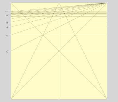 Figure 01.10.05The canon used to divide the page. See an earlier post about this, a test of the canon, here.Once the main measurements of the pages are determined, I construct a series of grids based on each division. From those grids, I can pull digital “leading” (the black square in the bottom right corner) to use to set distances in the design.
 Figure 01.10.06The pages divided into 1/12.After all of the grids were built, they were superimposed over each other. And within that “super grid” I determined where to set the margins. The top and fore-edge (outside) margins were set at 1/12, the bottom margin is 1/9, and the center margin is 1/18 (1/9 split across the spine).
 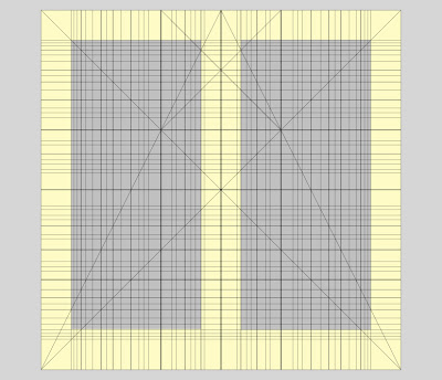 Figure 01.10.07The “super grid.” The gray rectangles show the text areas of the two pages.One thing that I am looking forward to is when these page divisions are translated into the “real world,” and I construct a ruler based on them, to use to register the plates while printing. But more on that later.
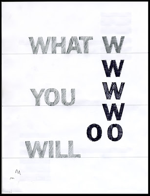 Figure 01.10.01Some tests of hand lettering for the theoretical title pages of the book What You Will.So, as I said before, there is backlog of these “Production is Reception” posts at the moment, as I have been working steadily on What You Will, but have not been writing about it (I was having so much fun with “Gleaming the Cube”).Early on in the process of brainstorming the design for the book, I thought that I might like to try doing some hand lettering for the title pages, and perhaps in the book itself. “Hand lettering” isn’t quite the right term, because I actually used my trusty “Gothic” letter stencils. I had no idea what the letters were actually going to look like, so I did some tests.
 Figure 01.10.02Narrowing it down.The main test was to determine how the letters could or would be filled in. I thought that if they were going to be stenciled, that they should be filled in, but not filled in completely. I wanted to make the fact that they were stenciled readily apparent. I settled on some sort of grid pattern for the filling-in, but then more questions came up: should they be filled in freehand or with the stencil as a guide? Should they have an outline or not? What thickness of line should be used? (See the bottom of Figure 1.10.03: “new”s and “newligh” to get a sense of how the thickness of the lines affected the individual letters.) All of these minor details were going to be important.
 Figure 01.10.03But then that importance fizzled so quickly. A day or two of pondering the drawings, reading the poems, and thinking through the rest of the design led me to abandon the idea of stencil letters for this book. They seemed unnecessary, a way of visualizing (in the sense of making visible, or rendering opaque) the language that was unrelated to the primary concerns that were developing and taking hold in the rest of the design. I like the way those stencil letters look, but they did not fit with the primary structuring principle of the book, so they had to go. Was the time that I spent on the tests wasted? Not really. First of all, in the large scheme of the book it wasn’t that much time, and second, and most important, time spent in development, even of ideas that are abandoned, is not time wasted. It is time spent narrowing and focusing, meditating, working out the shape and parameters of the book’s concept by testing its limits.
& here we are at the beginning of Year 10. Calendars of the first three months have been printed out and are hanging on the wall in front of me. The next month is heavily marked already. That marking-up of the days-to-come-and-pass is a result of two things: 1) a new teaching position, teaching an Intro to Book Arts class, and 2) a new book on the verge of full-scale production, Kyle Schlesinger’s What You Will. As the class develops, and as it unfolds in time, I hope to use the IDE(A/O)(B)LOG(Y/UE) to make some notes about book arts (art, really) and teaching. When I was in graduate school, our Foundations Program supervisor used to tell us that we should seek and develop some relationship between our studio practices and our teaching practices. That, to me, was one of those revolutionary ideas that makes total sense. It is, of course, trickier than it sounds. It is about the how of teaching, the structuring principles and how they are represented, as much as the what, the individual assignments and their subsequent critiques.The intoxicating energy of the new book is grinding its way through my bones. Printing begins this weekend, and printing this book will be a furious, glorious affair. There are a backlog of “Production is Reception” posts waiting, and I will try to catch us up on those in the coming weeks.Year 10, shimmering, turbulent. There is so much work to be done.
and I already know three broadsides that I will print specifically for the studio walls. First is this classic from the eminent scholar and typographer Beatrice Warde (which seems to be required decor for every letterpress studio): The image that you see here is from a photocopy of a version that they had in the letterpress studio at ASU. I will make a new edition.And this, a slightly modified version of what Woody Guthrie had written on his guitar, to be hung on the wall behind the press(es):
THESE MACHINES KILL FASCISM
And the last, a recently rediscovered piece of a poem by Jack Spicer, from his book Admonitions, from the poem “For Jack”:Tell everyone to have guts
Do it yourself
Have guts until the guts
Come through the margins
Clear and pure
Like love is


 Figure 01.10.04
 Figure 01.10.05
 Figure 01.10.06
 Figure 01.10.07
 Figure 01.10.01
 Figure 01.10.02
 Figure 01.10.03


